Global brand identity in 2026: six trends shaping how brands look, sound and feel
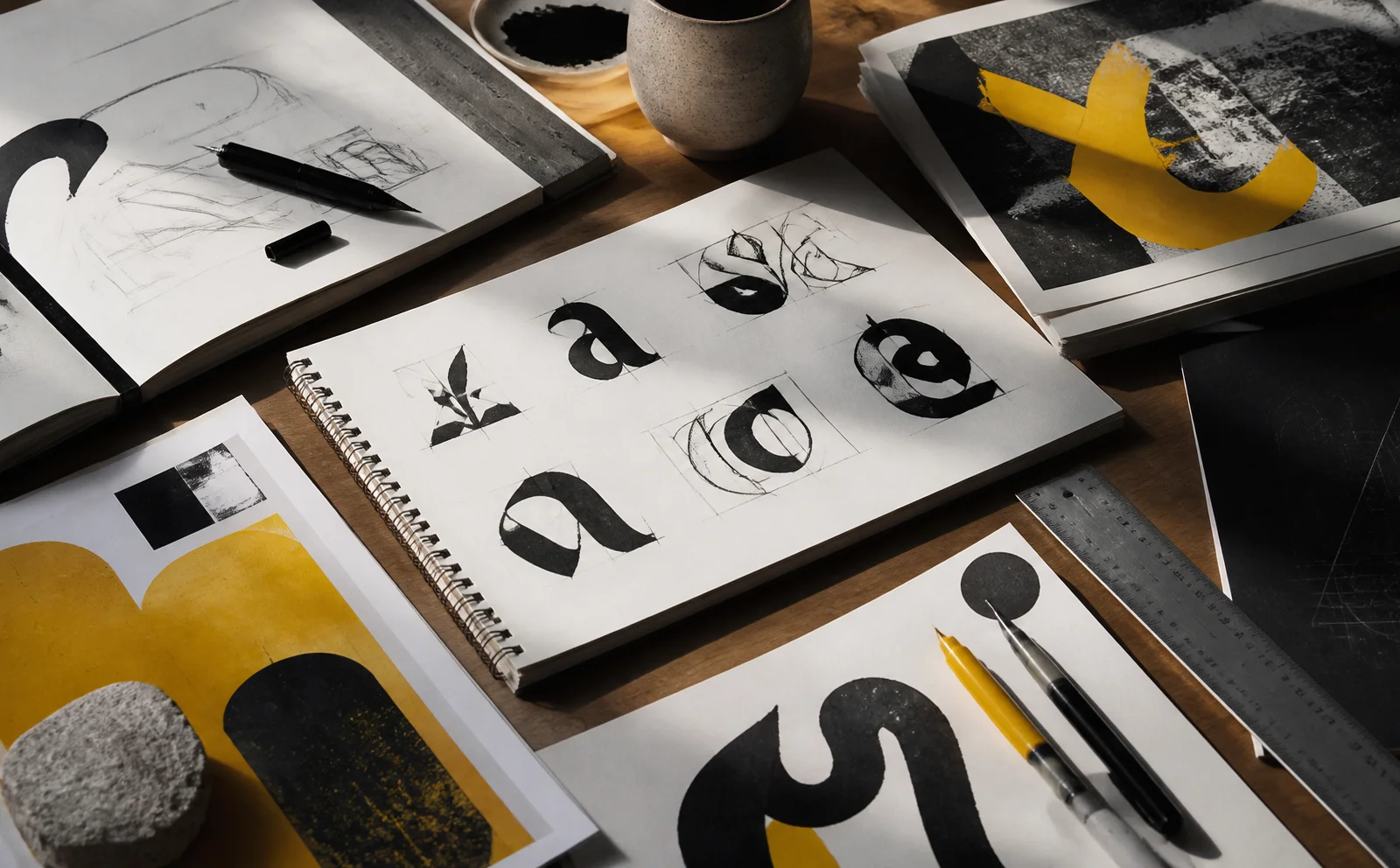
From the reaction to AI polish, hand-drawn type and tactile texture, to maximalism and identities that evolve: a synthesis of 2026 brand identity design trends and what they mean for businesses in Vietnam.
In 2026, brand identity is less about “what does the logo look like” and more about how a brand behaves, sounds and feels at every touchpoint. We read the year's trend roundups from studios, consultancies and design awards. Below are six themes that keep recurring, with Double D's view on how to apply them.
A note on sources: most of the material comes from agencies and vendors selling design services, and many statistics have no clear origin. Treat this as consensus direction, not measured data.
1. Deliberate craft: a reaction to AI polish
This is the strongest theme. As AI imagery floods feeds and starts to look alike, brands are choosing visible traces of human hands: lines that are not perfectly straight, paper texture, slightly off geometry, type that looks hand-stamped. Landor's global executive creative director calls it “Anti-AI Crafting”. Some sources call these rough edges “human labor signals”: cues that real people were behind the work. Canva's report is also cited as naming the wave “Imperfect by Design”.
Technical perfection is getting cheap. What is scarce is the trace of attention and craft.
2. Motion is the default
Identities are designed to move before they are designed to print. Animated logos, kinetic type and micro-interactions sit in the rulebook from day one because most touchpoints are screens. At Double D this is why every project includes a motion rules section covering duration, easing and rhythm.
3. Texture and the senses
Paper grain, embossed surfaces, noise and soft light are returning as a way to make screens less flat. Creative Bloq describes the trend as “tactile rebellion”. What matters is that texture has a logic inside the system; otherwise it is only a decorative layer.
4. Maximalism and bolder logos
The pendulum is swinging away from uniform minimalism. D&AD jurors said they want more differentiation and welcomed identities that lean into loud, expressive aesthetics. 2026 logo trend lists mention funky typefaces, early-2000s nostalgia and hand-drawn artwork. Minimalism survives, but warmer and with more character: warm tones, metallic finishes and industrial touches that balance clarity with approachability.
5. Type takes the lead
Several sources describe a shift: the brand name does the talking and the symbol steps back. Hand-drawn lettering, experimental type and retro wordmarks are paired with modern layouts. Variable fonts let one family flex across layouts while staying cohesive, and some brands invest in custom type as a strategic asset.
6. Refresh, don't rebuild
Some sources say the field is moving away from one-off rebrands toward identities that evolve, stretch and adapt over time. The advice repeats: “refresh, don't rebrand” when the foundation is still right. On color, several sources cite Pantone's pick as Cloud Dancer (11-4201), a warm white suggesting calm, while WGSN and Coloro chose a transformative teal. Because sources conflict, check Pantone's own site before quoting.
What this means for businesses in Vietnam
- Do not chase every trend. Pick one or two that match your positioning. A financial-services brand might choose warm restraint; a young F&B brand might go playful maximalism.
- Invest in the system, not only the logo. Type, color, motion, texture and voice should be written as rules so teams and partners can apply them consistently.
- Use AI to explore, humans to decide. Handmade traces only carry value when they are real.
- Verify with numbers. A good identity helps people understand what you sell faster and makes your message clearly different from competitors.
If you are considering an identity refresh, start with a discovery session: we will name the problem with you before choosing an aesthetic direction.
Sources
- 2026 New Branding Trends: Human Glitch and Death of AI — Inkbot Design
- Texture, warmth and tactile rebellion: the big graphic design trends for 2026 — Creative Bloq
- Maximalism is back in design, and it's needed more than ever — D&AD
- Branding inspiration: brand design trends for 2026 — Kota
- 8 design trends shaping brand identity in 2026 — Three Rooms
- Top 10 Branding Trends to Watch Out for in 2026 — Design Shack